package design
formatting meaning through package design.
“the medium is the message” — Marshall McLuhan
This project surveys how the medium and the form of package design can change the experience of the product. I chose to explore Tazo’s tea packaging. Tazo states “We’re on a quest to be the world’s most unexpected tea makers. We love to get right in there and mix it up. We’re half curious kid, half intrepid explorer, half undaunted alchemist. Yes– one and a half.” I loved the energy and playfulness of their story and wanted to showcase their exuberance via equally whimsical packaging.
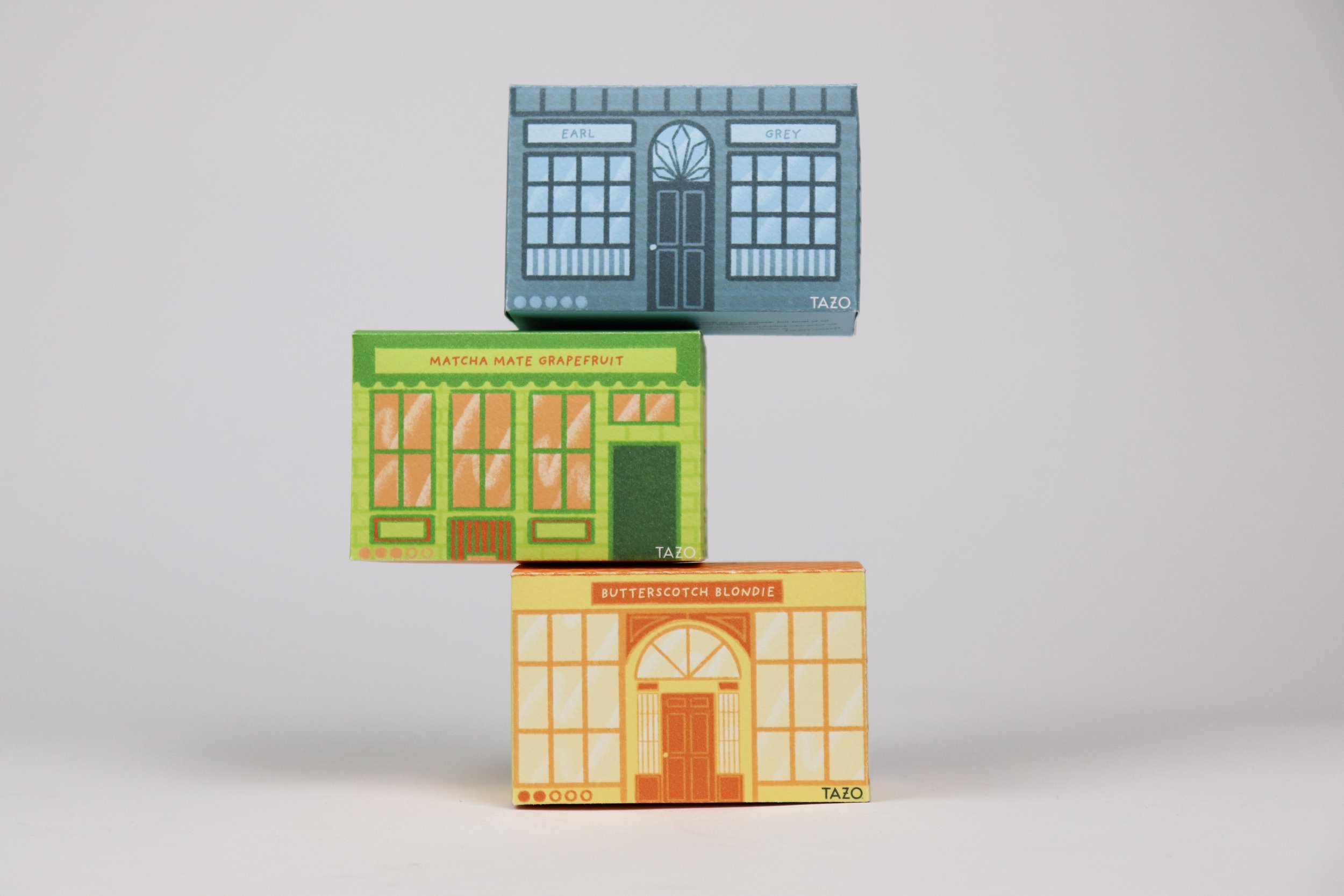
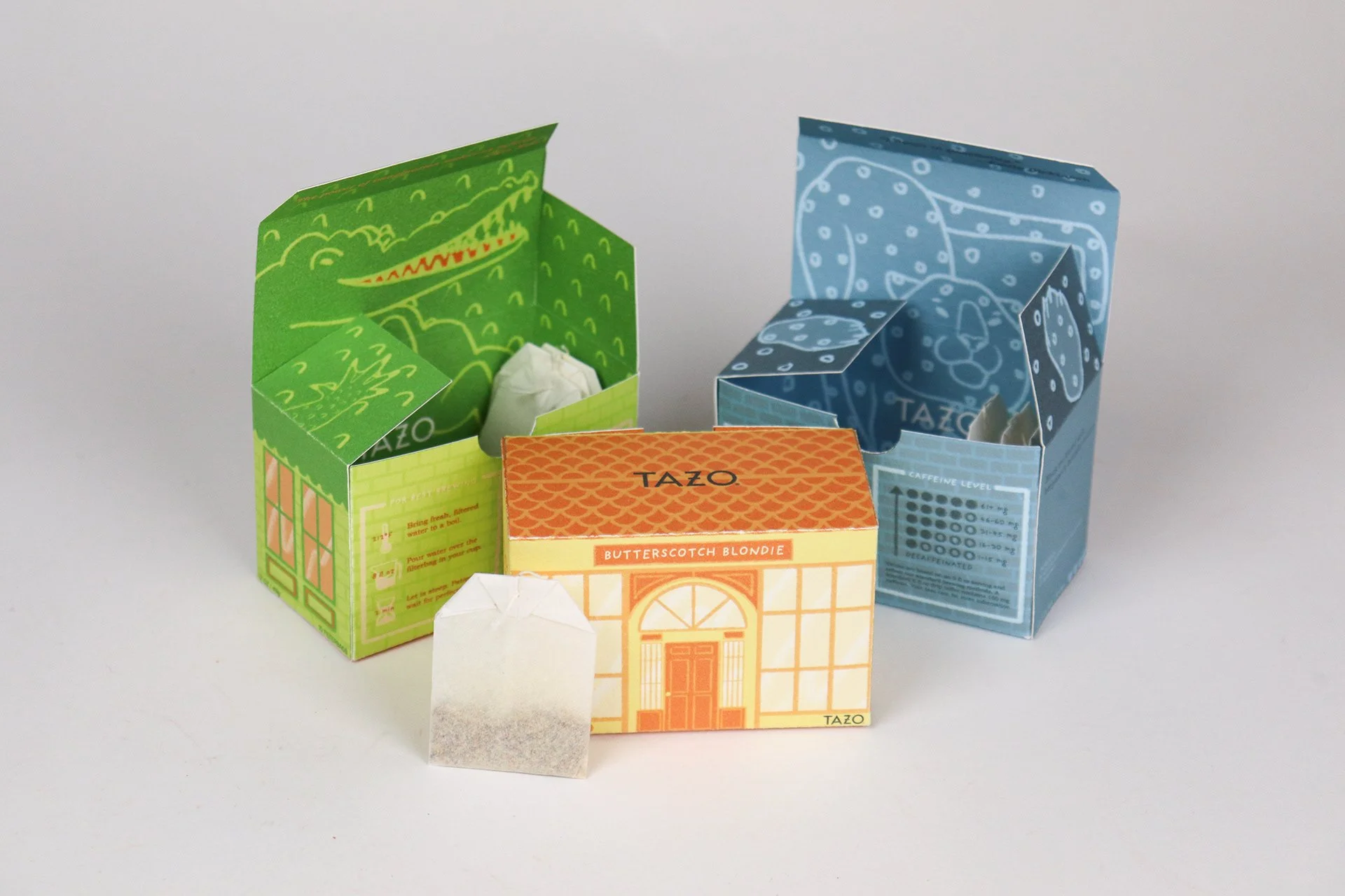
The fronts of the packages were designed to look like storefronts. I wanted the packages to look like a miniature community or a street plucked off downtown when placed on the store shelves. It could represent the fun-loving, Tazo-drinking community this company champions. It’s colorful, fun, and inviting. Something that would stand out when placed next to the countless number of tea brands in grocery stores.
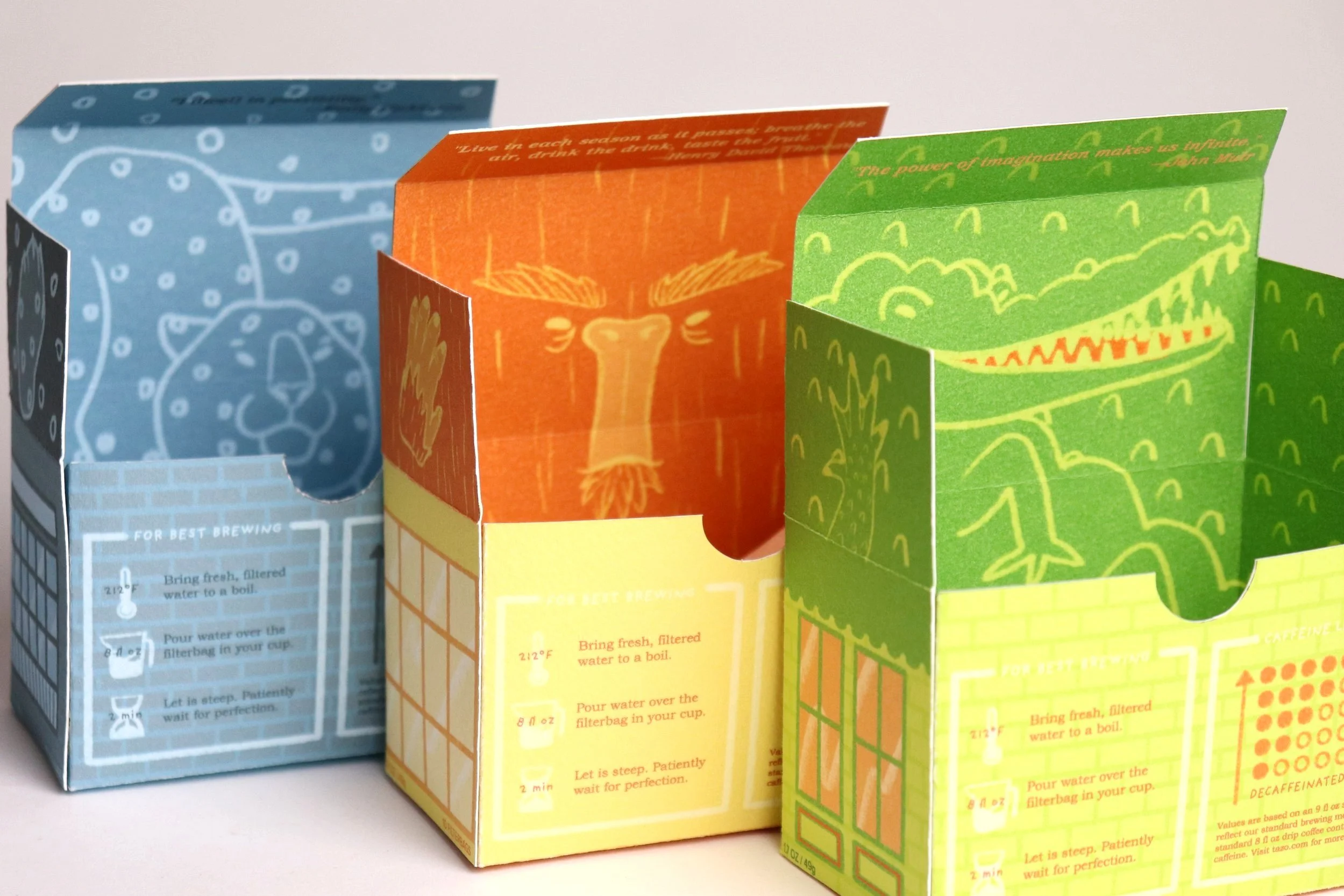
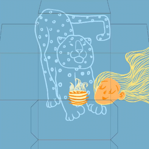
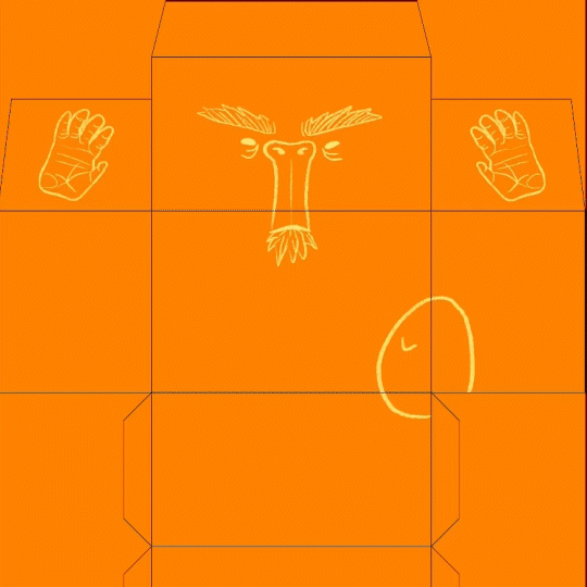
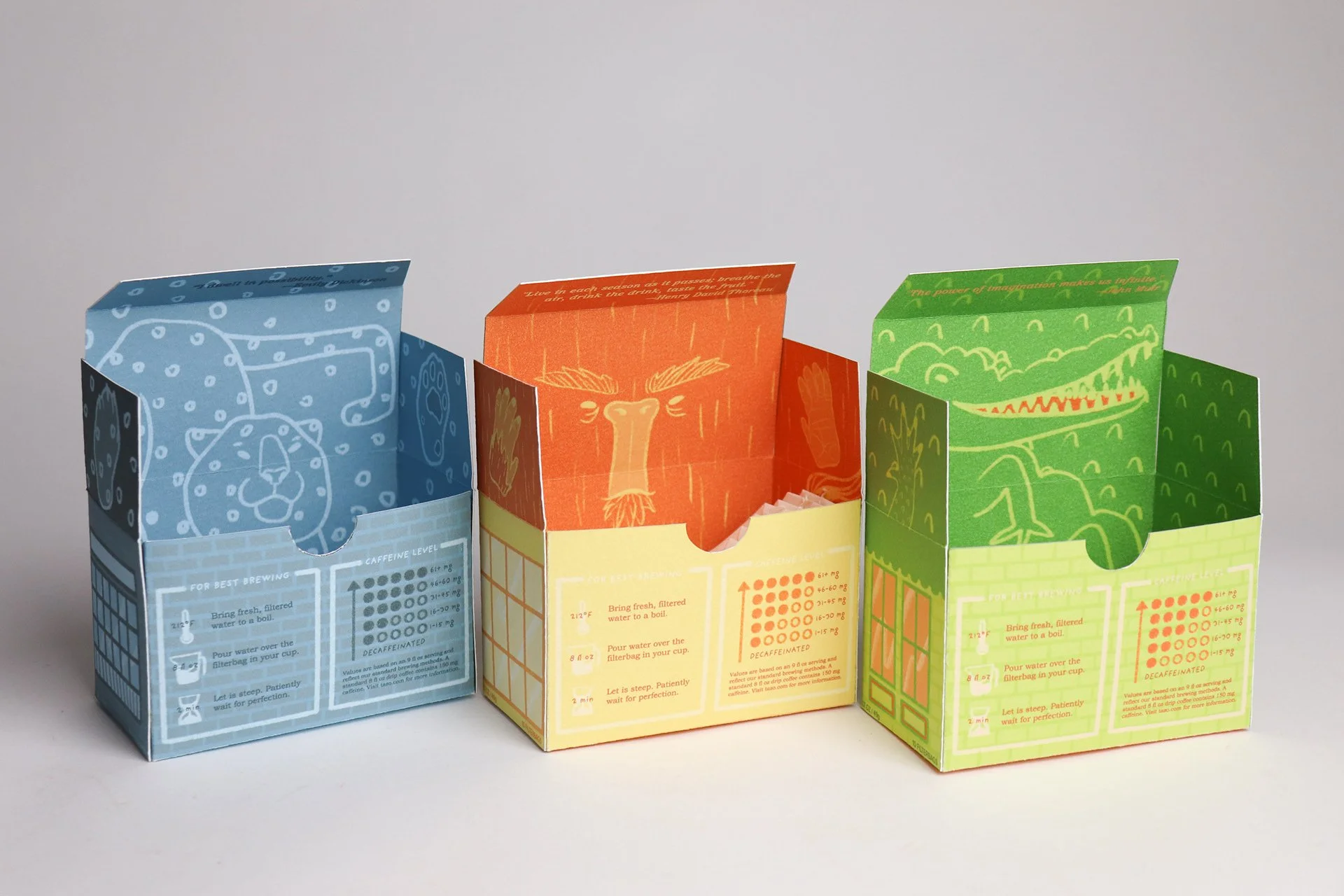
Now’s the exciting part. Once the consumer takes their little parcel of tea home, they open the package and BOOM. They’re welcomed into the wonderful world of Tazo flavors with open arms. A little wild friend awaits inside holding their precious tea safe. Their slogan can be read at the top “We’ve got our own thing brewing”. At the bottom of the box, an illustration of a lady happily drinking a cup of tea showing what the consumer will be feeling in a short few minutes.
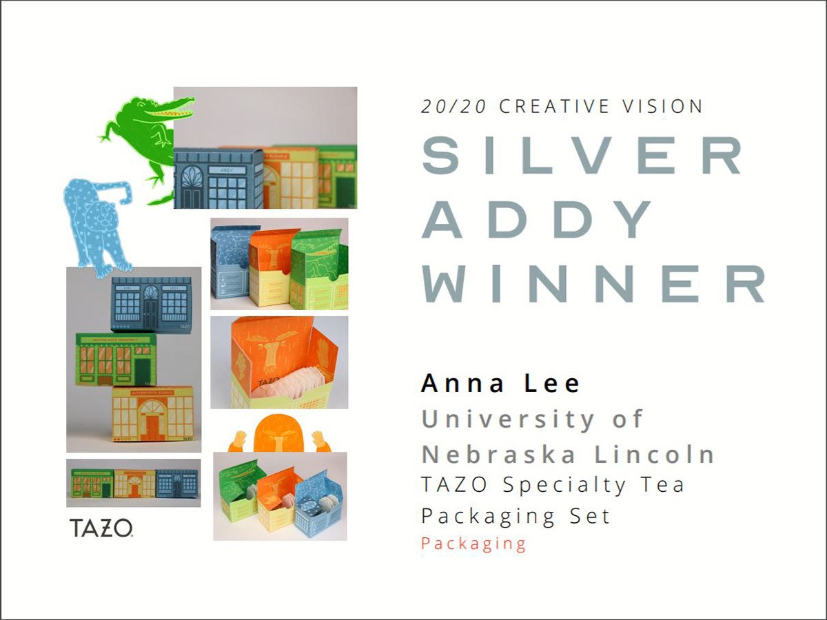
This project won a Silver Addy Award in 2020.
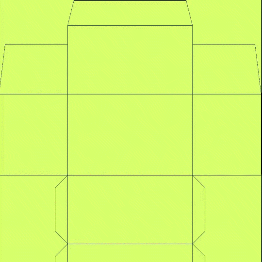
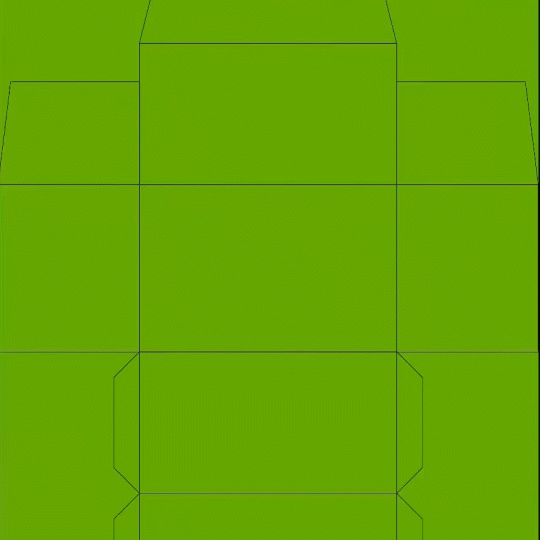
process.